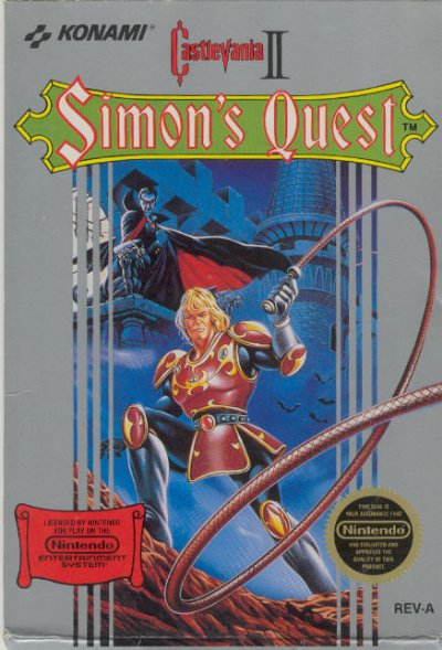
My most recent gaming adventures have taken me back down memory lane. After years of soul-tormenting nightmares, I sat down to confront my fears and take on the irrational challenge of Castlevania 2, Simon’s Quest. While I was playing this game, and discovering, after about 22 hours of mind-numbing questing, that I was making the game out to be much harder than it really was (it’d be very easy, had the translation for the villagers’ texts not been so poor) that I came across a series of ads for NES games from that same era. 
Ah, budding Nintendo. Its such a strange thing to look back and see the evolution of video game marketing. The humble roots of our beloved video game characters seem laughable compared to their highly polished images today. Take the previously mentioned Simon’s Quest, for example. The Box art for his Castlevania installment is pretty cool looking, even today. But, take a look at this:
Here’s a better example of character art evolution, our beloved Mega Man (I hear he has some fans around here). Left, Mega Man 1 original package art. Wow, someone at Capcom got their 15 year old son some work doing package design. Check out those yellow highlights on the costume. Check out the hand gun, and the city in the background. This is the kind of work you tend to see on sci-fi novels at Dollar General, and not a real selling point for the game.
Later, you got this next piece, the international art for Mega Man. Looks more like a promo piece for a Conan novel, but at least the costume and arm blaster are correct.
A few years later, Mega Man 2. Again with the hand gun, and for whatever reason, Dr. Light is directing Crash Man to kill the blue bomber. All of these bits of art are pretty indicative of the 80’s game scene, where artists who never really played the games were hired to do the art. They made something vaguely marketable, but nothing that could be considered branding, so and no real recognition can be found between any of them.
It wasn’t really until Mega Man X when Keiji Inafune and his team did a huge redesign that Mega Man’s image became solidified. Unlike the prior series, X’s art has remained consisten
Its interesting to think that even our old stand by characters have changed so much over time when newer characters like, say, Lara Croft, have managed to survive over the course of 8 sequels with no greater change than the addition of sunglasses or a re-sculpting of the bosom. But even our dear Mario once looked like a weasely plumber characature, whose art style seemed to come right from the pages of Will Eisner’s sketch book. Yoshi, a staple of the Mario universe since the SNES, has remained mostly the same, but has changed drastically in his body proportions over time as Nintendo sought to consolidate its art department and marketing.
The slick imagry of today’s games are generated in a more controlled environment with commerical analysts checking every aspect of the product before it is finally released to the public, under a similar kind of scrutiny that a series of costumes in a Hollywood film might recieve before being unveiled to the public.
It can be nice to know that the characters we have emerging on the Play
Oh early Koopa, you mutant lookin’ bastard (ultimately, my true inspiration for the article). How I love you. Anyway, here’s another comic. Enjoy!
